Nate's Website Review: Mapping the Destruction of Tennessee's African American Neighborhoods
Note: Normally, I would cite in Chicago style as is expected with most histyory papers. However, due to the Paper's requirements for in-text citations, I used the MLA citation format which makes in-text citations for websites easier to trace back
Introduction
The website I am reviewing is a digital product for the Civic Design Center called Mapping the Destruction of Tennessee's African American Neighborhoods. It is a mapping GIS project with the purpose to educate the Tennessee public on the destruction of African American neighborhoods across various cities in the state. Specifically, the project covers East Knoxville, South Memphis, Chattanooga’s Ninth Street, and three areas of Nashville: Edge Hill, Capitol Hill, and Jefferson Street.
Purpose
Mapping the Destruction of Tennessee's African American Neighborhoods aims to educate the Tennesee public how these areas of the state were gentrified along the lines of race through urban renewal starting in 1937 to highway programs in 1956. The housing replacing these communities was often individually better, but was much more expensive than what already economically depressed people of color could afford (Keith Mapping the Destruction Introduction). Therefore these urban renewal projects were oftentimes gentrifying projects, sometimes forcibly removing people from their land into segregated camps such as Chattenonga’s Ninth Street (Keith Mapping the Destruction Chattanooga-Ninth Street). The 1956 Federal Highway Act birthed the vast American interstate system but also required large amounts of space on valuable urban land. When Tennessee was faced with this problem, the state opted to destroy African-American communities located close to the heart of the city. Additionally, the practice of redlining made it so those who had their houses demolished could not find housing to replace what they had lost (Keith Mapping the Destruction Introduction).
Design
The website itself is only eight pages, with a simple interface along the top of the screen. The top interface labels each page as a tab that allows users to skip around in the project to what interests them. The tabs are labeled: Introduction, Nashville-Jefferson St., Nashville-Capitol Hill, Nashville-Edgehill, Chattanooga-9th Street, South Memphis, East Knoxville, and Contact Us. (Keith Mapping the Destruction)
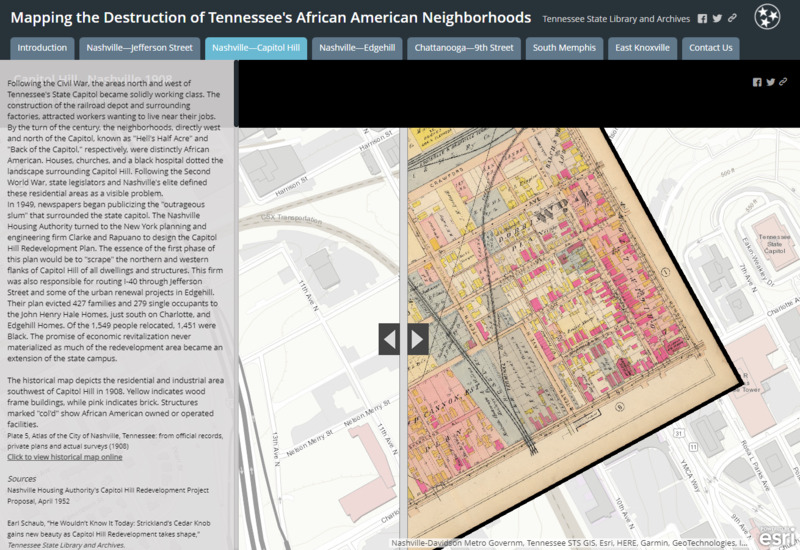
The pages apart from Introduction and Contact us all have a similar design. Historiographic information is located on the left third of the page, with accompanying pictures and citations at the bottom of the text section. The right two-thirds of the page is made up of an interactive map overlay, showcasing the destruction of African-American neighborhoods. Though the text and map differ for each tab, the design remains constant throughout the six informational pages. (Keith Mapping the Destruction)
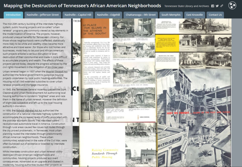
The introduction page contains contextual information about urban renewal and interstate planning, and how seemingly benign laws were weaponized against African-American communities. The introduction also provides a framework to view the project through, specifically how racial oppression developed from the built environment to a lived experience (Keith Mapping the Destruction Introduction). The Contact Us page only contains contact information for Zachary Keith, the creator of the project (Keith Mapping the Destruction Contact Us). Both the Contact Us Page and Introduction Page feature text on the left third of the screen despite not having a map overlay, likely to keep consistency across the project.
This design is mostly functional. The aesthetics are simple and are not particularly novel. Its text interface consists of reading in a small font and scrolling down, so it’s easy to lose viewer attention in these details. The design does well focuses the user on the project’s strong suit, which is the digital map overlay. Listing the pages at the top also helps users to navigate around Mapping the Destruction of Tennessee's African American Neighborhoods in a simple way.
Functionality
The major piece of functionality which really makes this project unique is the way in which it presents digital map overlays. For each of the six informational pages, a contemporary google street view is provided of the area the page is discussing. There is a bar in the middle of the screen which the user can drag over the image. When the bar passes over the google street view, it shows an overlaid 1940s era map of where the African American neighborhoods used to be, and what is there now. The Nashville-Capitol Hill page, for example, shows an embedded street map of the open area around the Tennessee State Capitol Building. When the user drags the bar over the screen, they see the overwhelming number of buildings that must have been destroyed in order to make a sightline from the train station to the Tennessee Capitol Building (Keith Mapping the Destruction Nashville-Capitol Hill ). The tool is created with ArcGIS, a mapping software through Esri.
The effect of the user being able to control a shift between the present in the past emphasizes the weight of demolishing neighborhoods. There’s a sense of terrifying awe to swiping across a screen and literally wiping away the lives and homes of hundreds of people. In this way, Mapping the Destruction of Tennessee's African American Neighborhoods uses their digital map overlays creatively and effectively to achieve the site’s purpose of educating the public as to how these areas of Tennessee were gentrified along the lines of race through urban renewal.

Historiography
Mapping the Destruction of Tennessee's African American Neighborhoods sources a majority of its evidence from county and town archives, along with fire insurance maps between 1934 and 1956. The project uses local newspaper clippings to explain the state’s rationale for these renewal projects. Newspapers also help to make up various contextual information, such as in Chattanooga where the local paper claimed that they were “moving the families of all negro Government employees across the river and locating them in a camp near the ridge” (Keith Mapping the Destruction Chattanooga-Ninth Street). The displacement of African Americans in Chattanooga reported in the newspaper supports the project’s findings concerning the destruction of Ninth Street. At the bottom of each of the six informational pages lies a list of further reading on the matters they discuss, giving users the resources for further research if it suits them.
The project is historiographically successful in the way that it contributes to known scholarship on race-based gentrification in the United States. Mapping the Destruction of Tennessee's African American Neighborhoods adds locality to existing research on oppressive housing practices by targeting the story of specific neighborhoods. An example of existing foundational scholarship which added locality to existing research on redlining through digital mapping was the project Mapping Inequality: Redlining in New Deal America.
Mapping Inequality: Redlining in New Deal America and Mapping the Destruction of Tennessee's African American Neighborhoods used similar map overlays to assign real-world examples to racially oppressive practices in mid-century US urban planning. Mapping Inequality however is more comprehensive than Mapping the Destruction, covering hundreds of cities with redlined map overlays. Mapping Inequality also has much more in the way of map overlay options (Nelson et al. Mapping inequality).
These quality differences are to be expected, Mapping the Destruction of Tennessee's African American Neighborhoods is a much smaller project made by one person (Zachary Keith), whereas Mapping Inequality was a much bigger project with more contributors and funding (Keith Mapping the Destruction Introduction). Given these differences, Mapping the Destruction holds up well by using the same digital map overlay as Mapping Inequality and makes up for the difference in resources by focusing on a much smaller area.
Both projects add locality to the scholarship on racially oppressive practices in US urban planning by categorizing areas that users can recognize. Mapping Inequality had a large audience, which necessitated adding towns and cities from across the continental United States (Nelson et al. Mapping inequality). The audience of Mapping the Destruction of Tennessee's African American Neighborhoods is the public of Tennesse, so it is likely that a potential user will be familiar with the locations discussed on the project’s website (Keith Mapping the Destruction Introduction). Mapping the Destruction users are able to lookup local cities they are familiar with to see how these historic urban planning decisions affected spaces they already have attachments to. By adding locality in this way, the project not only adds locality to existing scholarship but earns the user’s investment.
Recommendation for Mapping Violence
Our project can learn from the functionality of Mapping the Destruction of Tennessee's African American Neighborhoods. Specifically, in the bar which wipes over the map alternating between the street view and the overlay. I think this can be used in conjunction with the two aerial photos from Anna Rebrii’s presentation on violence in Sur. Instead of the bar alternating between a street map and an overlay, it could alternate between these two photos. The photographs, originally from the UNESCO report, create a focal moment for the gravity of the project. Using the bar function from Mapping the Destruction to alternate between these two photos would be a way to recreate that focal moment in a way that would be engaging to the user because it would be entirely user-controlled. Furthermore, the feature should be easy to implement. It was made using Esri’s ArcGIS, a GIS mapping software that should fit well into Omeka’s source code (Esri.com ArcGIS pro). Once our team gets access to ArcGIS, implementing the bar swipe over the images is a matter of getting the two images into the software (Esri.com ArcGIS pro).
Bibliography
“ArcGIS Pro.” 2D, 3D & 4D GIS Mapping Software, https://www.esri.com/en-us/arcgis/products/arcgis-pro/overview.
Keith, Zachary. Mapping the Destruction of Tennessee's African American Neighborhoods, Tennessee State Library and Archives, https://www.arcgis.com/apps/MapSeries/index.html?appid=8dba65584072450ca8928a5f3408373f&fbclid=IwAR0oMoV29A3QElz87LVdJ6s-KzEmBNnMDqQK_tRg5jSNVklxA-5K1fW4hFA.
Nelson, Robert K, et al. “Mapping Inequality.” Digital Scholarship Lab, University of Richmond, https://dsl.richmond.edu/panorama/redlining/#loc=5/39.1/-94.58.